Many engineers feel insecure, when they have to design slides. They don't know how to pick colors that work well together. If this is a problem, here is a small set of rules. Maybe nobody will call your slides "beautiful", but nobody will call them "ugly".
If you feel unsure about colors, then do not use colors. Black on white is enough. Syntax highlighting might be an exception, but even there black on white is ok.
Do not use white on black, although you might feel comfortable with it, if you love your command line. A white background provides better contrast, because there is more light coming out of the beamer.
If you have images, make them fullscreen images. Fullscreen also applies to diagrams, plots, etc. If the aspect ratio of a picture is different than the slide ratio, use a black background.
Only use one font. This includes stuff everything on the title page, the title on each page, and the meta information in the footer on each slide.
If unsure, use some default font, like Times New Roman or Arial. You can use uncommon fonts, but stick to normal (readable!) ones. The danger with uncommon fonts is that they are missing something and your system tries to find a substitute, which usually looks wrong and out of place.
Ok, you are allowed a second font, if you show code. Use a fixed-width font for code. The font you use in your terminal or IDE is probably fine.
Use only bold for formatting. Ok, size and maybe italic is also allowed, but only change one parameter. If your title has a bigger font, then do not make it bold. You could also make it bold, but at the same size as the rest. Do not use underline, small caps, or other fancy stuff. This goes wrong too easily.
Use a big font size. You cannot make text too big in a presentation. If you have to use a small font to fit everything onto a slide, then try hard to split the text into multiple slides.
Left align everything. There is no law that you have to center anything. Not even the title. Left align feels more structured, because everything lines up on the left. Things lining up is generally a good thing.
Avoid bullet points. Consider "one statement per slide". Consider to simply remove the bullets, so the text lines up with the rest (title, page number, other text).
No decorations. Do not use a colorful default template, just stick to the plain black on white.
The point of a decorated slide template is to make the slides recognizable. Unless you explicitly have this goal, ignore decorations.
The resulting slides look simple. This is good, because you do not want people admiring your slides. You want them to listen to you.
Here is a direct comparison:
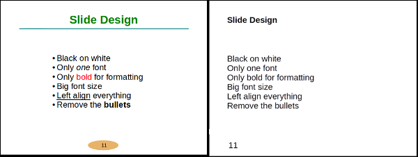
On the left I violated nearly every advice from above. It looks childish. The tragedy is that you invested time to make it ugly. Compare the serene look on the right. It is less work and looks better.
I also wrote about different presentation styles and tips for technical presentations specifically.